

You’ve just been given access to your new Volcanic website, or you want to give your current website a re-vamp by choosing some great looking images for it – but where do you start!?
Choosing the right imagery for your website is really important, as it’s the first thing your website visitors will see and can draw them and engage them further.
This blog outlines some tips to help you choose the best imagery for your website so your site visitors get the best possible experience and increase website conversions – win!
Finding the right images
There are thousands of images online that you could use for your website – some you may have to purchase and some are provided on free stock image websites (we’ve listed these further down).
Do: In your search for stock imagery, start with words and phrases specific to the page on your website or your recruitment agency.
For example, if you specialise in business recruitment, look for “contemporary business” or “modern professionals”.
Don’t: Be too generic. You will waste time sifting through unrelated images, that you're likely to pick one that won't give you the best outcome. E.g. searching for “London” rather than “London contemporary buildings”.
TIP: Once you’ve found a picture you think might work, try it on your website – if it doesn’t work, keep looking and try again!
Image sizes
Once you’ve found good imagery for your website, ask yourself “Are these images the right size for where I want them on my website?”.
Do: Investigate the image sizes required for your website, to ensure the pictures look of high quality and aren’t pixelated or stretched.
For a Volcanic website, these are:
- Main banner – 2000px x 1500px
- Sub-banners – 2000x700px
- Consultant images – 512px x 512px
- Sector images – 700px x 700px
Don’t: Use extremely small images in places where a larger image is needed, e.g. the main banner on your homepage, as this can cause them to look blurry, out of focus, and may cut off a large part of the image.
Similarly, don’t use extremely large pictures where a smaller image is required, e.g. your sector images, as this will drastically affect page loading speed. The optimum size for page loading time is less than 2MB.
The importance of focal points and angles
Did you know you can control user behaviour on your website by guiding the eyes of the user using lines and angles, pointing them directly towards particular messaging or call-to-actions? Impressive stuff, huh.
The lady looking down in this photo guides the
eye down to the content below. Clever!
Do: Choose images with a strong focal point for your website’s main banner – this is the first part of your website visitors will see, so the imagery should be powerful and relevant to your site.
A focal point will draw their attention to the page; however, ensure your focal point isn’t directly behind your text like the example below, and isn’t to the far right-hand side of the screen so that it is cut off on mobile devices.
Angles are also a great way to draw depth into your website and provide a good focal point. You can see in the example below that the line angles downward, guiding the eye from right to left, towards the CTA button.
For things like sub-banners on your website, e.g. on your ‘about us’ page, the focus needs to be on the wording so strong focal points are less important here. Subtle patterns bring texture to your website, further drawing visitors in without taking attention away from the page’s content.
When it comes to consultant or meet the team images, ensure they are the correct size and that the object of the image is in the centre so that they appear correctly on the consultant’s profile. See examples below:
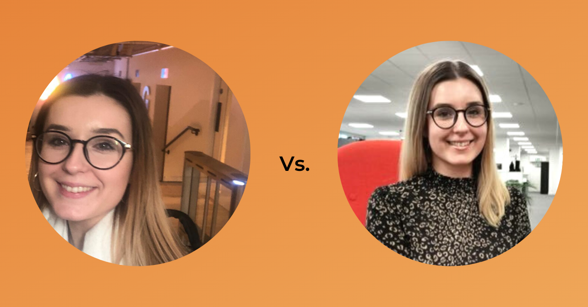.png)
Also, keep it professional! It’s a professional profile, save your pouty selfies for Instagram! If you don’t have professional work pictures, try and take a sensible photo against a neutral background.
Don’t: You may come across images with wording on them – AVOID THESE.
Images with wording on them like the above don’t respond well on mobile devices, meaning the wording will be cut off.
Relying on wording in an image to introduce the page content isn’t good for your SEO as search engines won’t be able to pick up the page title.
Text on images are often bad for accessibility as well, as it can exclude those with visual impairments, and very rarely will match your branding in terms of fonts and colours.
Image styling
Do you know that there are different styles of imagery you can use on your website? These might include corporate, stock, conceptual, abstract, location, plus more!
Do: It’s important that you use similar styles of imagery on your website, so the look and feel is consistent across each page.
Similarly, it’s good to use images with consistent colour tones throughout them – these can match your branding colours, be an accent colour to specifically stand out or be consistently warm/cool.
Don't: Use abstract images on one page, and then jump to a corporate image on the next.
If you’re not sure if your images are consistent, ask yourself if the images on your website could be considered from the same location? If the answer is yes, then you know you’ve maintained a level of consistency across your site. If the answer is no, why? Are your images consistent in style or do they vary?
Using imagery in creative ways
Images are a great way to tell a story on your website, either of your company, your values or your target audience.
They can be used to brighten up a page or even break up heavy chunks or text.
Do: If you’ve got a list of information you want to display on an already text-heavy page, break up the text with icons or an infographic outlining the message.
Don’t: While it’s great to break up text with imagery, don’t over do it! You don’t want the page to read disjointed or your message to be diluted – it’s a fine balance.
Our final piece of advice is, don’t rush! Truly think about how you want your company to come across, and look at other websites! What are they doing differently? Can you adopt a similar approach?
If you stick to these tips, you’ll be a pro at selecting images for your website in no time!
Websites featured in this blog:
Websites for imagery:
https://www.pexels.com/(free to download)
https://www.dreamstime.com/(free to download)
https://www.freeimages.com/(free to download)
https://unsplash.com/(free to download)
https://pixabay.com/(free to download)
https://www.shutterstock.com(Free images included in most Volcanic products)


